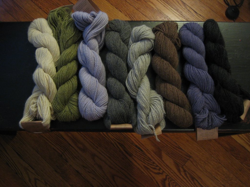
Are these colors too bland for a brown fair isle sweater. Will the blues and grays just blend together into one cool color mess? I love the icy hues but I’m afraid they just wont show up. Do I need to exchange these for some peppy reds and oranges? Any advice would be greatly appreciated!!


12 comments:
Used judiciously, I don't see why they wouldn't work. They look good to me!
I'd say just make sure you place the colors next to each other so the contrasts are there, and you'll be fine. I love those colors!
I think you should do a faire isle swatch to really be sure. It would be very hard to guess. I know it's a pain, but swatch up using your color choices and put it on the brown. Let us know how it looks!
I think those subtle colors are lovely!
Try a swatch and experiment with putting different colors next to each other. Some may pop more in relation to what they are contrasted to. But, I also think throwing some red in there is a good idea...
i'm guessing that you probably don't want to swatch because you'd just like to return them if you don't like the color contrasts :) but i think that subtle fair-isle is really nice. i, personally, just don't go for the bright and outrageous mixamatosis colorways in fair-isle, so i really like these colors together!
I think that green skein i your key to succes--it has enough pop against the other colors that you'll have contrast without it being screamingly loud.
i agree that with the proper planning, this will look great. but if you are really yearning for red, you should probably get it.
just saw your post below -- i think i have the same teddy bear! maybe mine needs a hat, too.
I think they're beautiful colors--I'd go for it if I were you, it doesn't need to be super-contrasty.
I think these look great - very traditional. not every sweater needs high contrast, and in particular, with fair isle you're often looking for colors that make an integrated design, not ones that scream out all on their own.
I like the blend of these- they are in the same family, so if you're going for high contrast, you might want to revisit the choices. Personally, I love the colors you've chosen, especially the green!
I like these colors a lot, and agree that placemenbt is key. They remind me of the brown/blue faire isle in the Reynolds ad in the current Interweave Knits--really pretty.
Post a Comment